
ProjectBranding + Web Development
Crafting a digital identity for a full-service marketing agency.
Logo, colours, brand book and a website designed and built by us.
Haarlem Agency is a marketing agency with deep roots in Haarlem. We designed their logo, colours and typography, put together a brand book and then designed and built the website ourselves.



Elian, Melvin, Steff, Tolga worked on this project. Meet them
- Client
- Haarlem Agency
- Sector
- Full-service marketing agency in Haarlem
- Services
-
Branding
Web Development - Published
Haarlem Agency wanted a new brand identity and a website to go with it. Both needed to show their love for the city alongside their marketing work. We did all of it ourselves, the web development included.
The brand was meant to speak to businesses of all sizes, a startup in the neighbourhood as much as a growing brand looking to scale. We went for something professional and modern that still carried the charm of Haarlem’s streets and people.
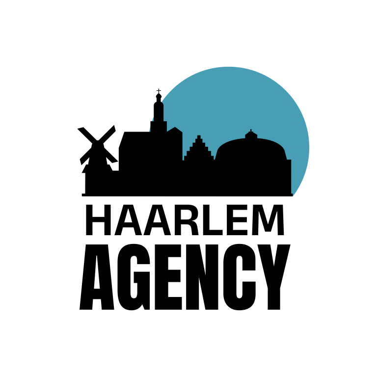
A skyline against a blue circle
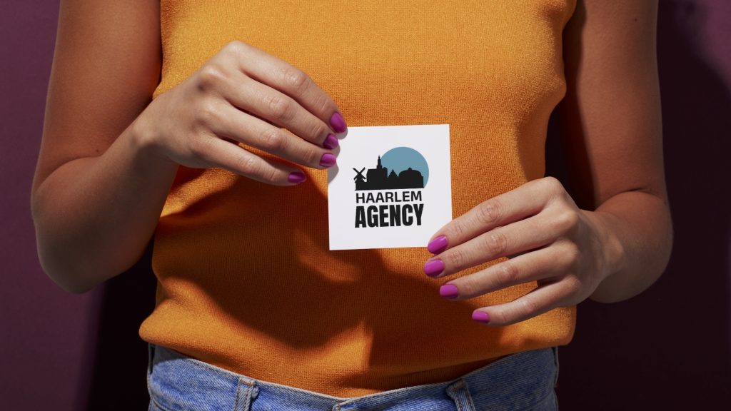
The basics came first, which for a brand are the logo, the colours and the typography. Our logo for them is a black skyline of Haarlem with a windmill at its left edge, set against a blue circle that stands for the sunset. Below it the agency’s name is stacked in black capitals, the word Agency in the heavier weight.

For the palette we used three shades of blue, plus black. One of those blues is the circle in the logo and the page colour of the brand book’s logo and About pages.
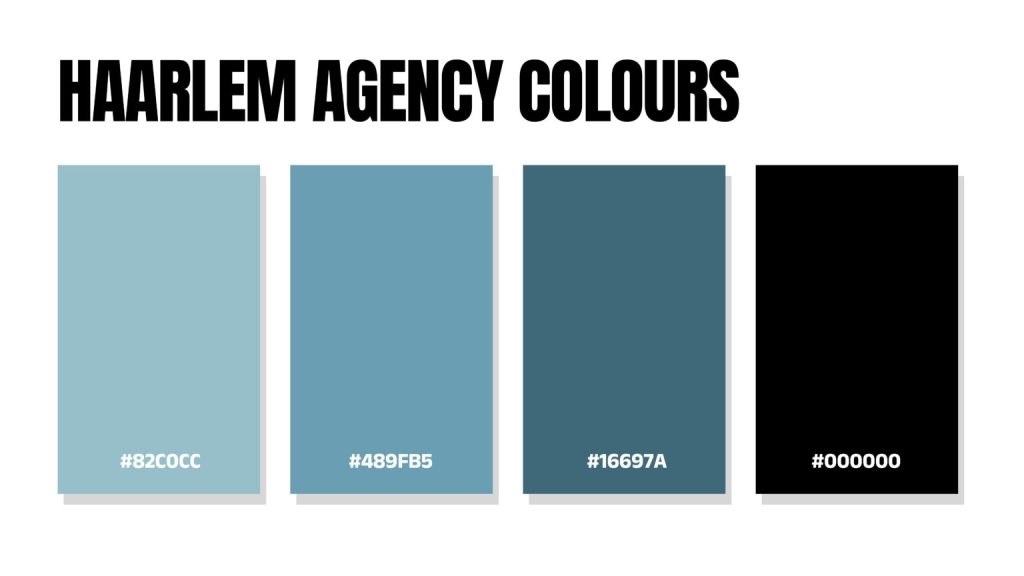
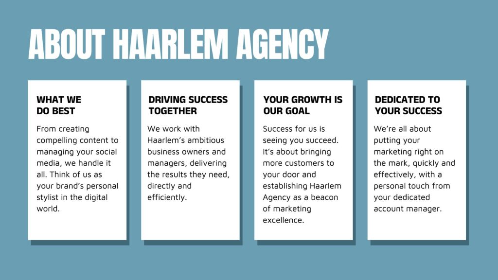
From there we designed the brand book, so the logo and the colours are set down in one place, the colours with their hex codes. Its About Haarlem Agency page says what the agency does and who it works with, on four white cards under a headline in heavy capitals.
Eight services on one page
The website followed. As on any website job of ours, we agreed the scope and made a plan before drawing anything. Design came next, then the build, and the site was tested before it went live. The pages are clean with a few bold elements, and we wanted the site to be fun and easy to get around.
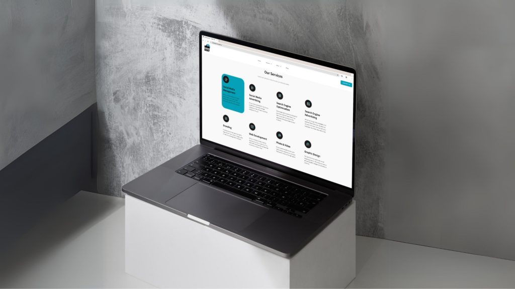
Take the services page. Eight services sit on it as separate blocks, the first one picked out in blue. Every page gives a potential client a clear path to the services and a way to reach out.
Published by the Social Sparrow team. Social Sparrow has worked in the Netherlands since 2020 and in the UAE since 2022, and is a Google Partner agency. About us